30
2017Whoa, That’s Deep…
Shot of the Month – November 2017
 One of the great challenges of photography is that our images are forever trapped in a two-dimensional plane. Alas, this often renders our images a poor representation of our richly three-dimensional world and many images can look flat and, well, boring. While we can’t overcome the physical realities of this space-time conundrum, we can use some nifty composition techniques to create the appearance of depth in our photographs.
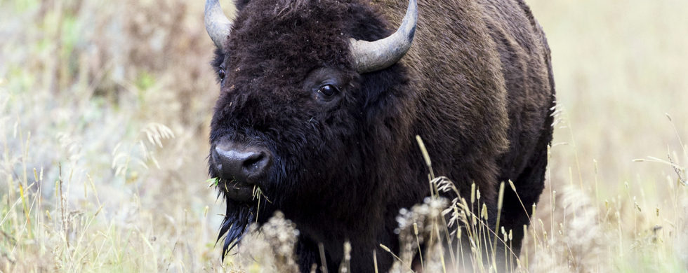
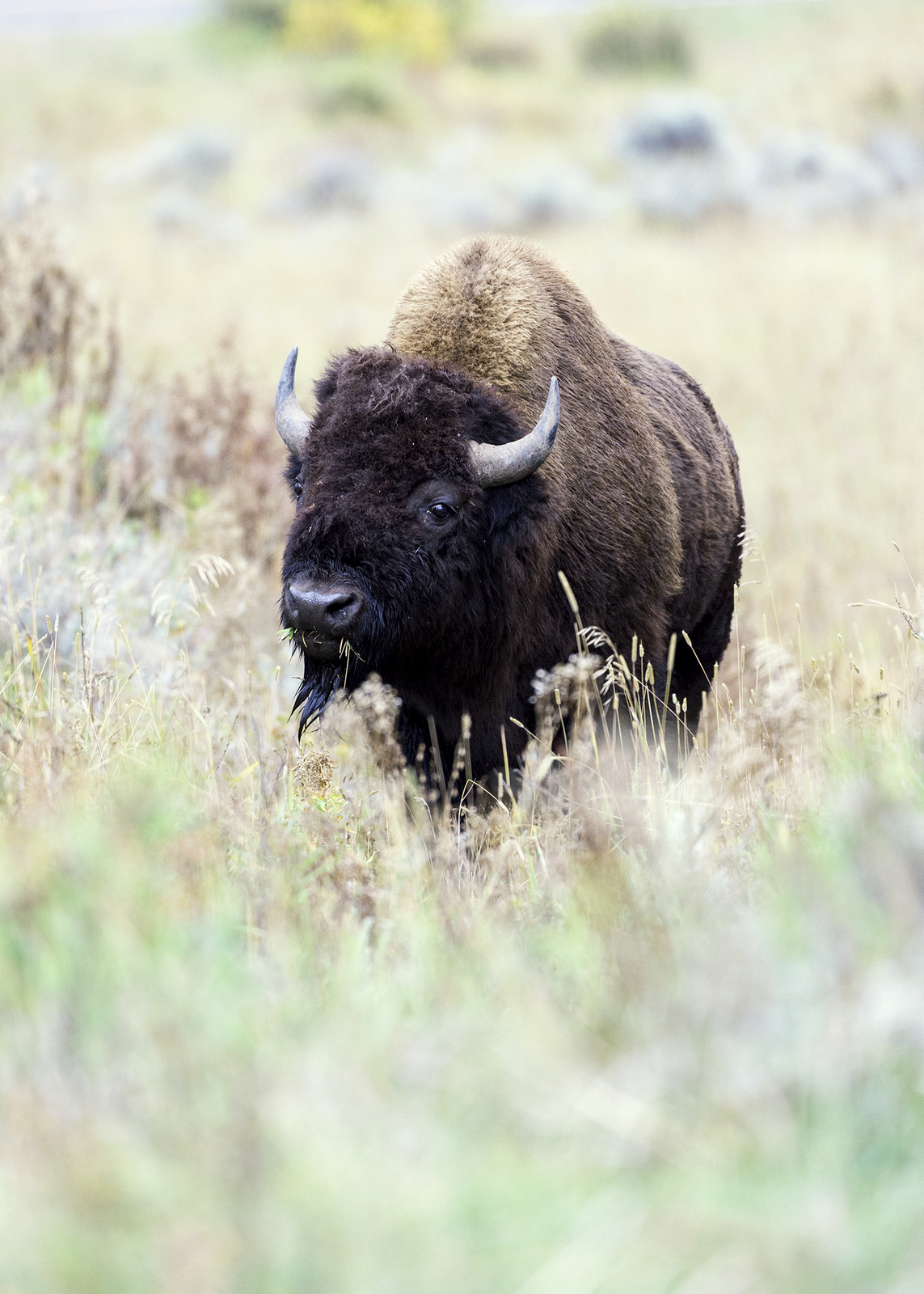
For example, I have dozens of photographs of bison — most of which are pretty mundane — a large brown creature not doing very much. But look at this image — wow, I love how my eye is drawn in. There are so many layers that the image becomes much closer to giving a sense of our 3D world. With this image, we don’t just observe, but we are pulled in and explore the space.
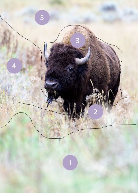
How did we get so much depth in this shot? Let’s break the image up into different zones as shown in the image to the lower right and see how they build depth into the scene.
Depth of Field
By using a wide aperture on my lens the resulting shallow depth field leaves only the bison in sharp focus. Our eyes are naturally drawn to elements that are in sharp focus. In this image, the bison really pops compared to the grasses in front and behind her and provides a sense of depth. (Zone 3) For the basics on understanding depth of field, click here.
Foreground
A visual element in the foreground can add depth. In this image, the out-of-focus green grass provides the first layer to the image. (Zone 1)
Images with the greatest amount of perceived depth will include elements in the foreground, middle ground, and background. In this image, we have the green grass in the foreground, the bison in the middle ground, and the out of focus, but visible bushes of different colors, in the background. Zone 1 is out of focus and green. Zone 2 is still out of focus but now a different color. With zone 3 the bison is in sharp focus compared to all the other zones, and its rich brown color also provides a clear distinction. The color transition of zone 4 from front to back and the verticality of the brown plants in the rear of this zone lead the eye back away from the bison to the empty plain and colored bushes in zone 5.
Overlapping Elements
By having elements in different layers partially block elements behind it one creates the impression of depth. The green grass in the foreground is the first barrier to entry and then we have that yellow grass just before the bison that partially obscures the massive beast. It doesn’t seem like much, but that little bit of yellow grass in front of the bison does a lot to help add a sense of depth to the image. (Zone 2)
Shoot in Portrait
Shooting in portrait helps encourage seeing depth. How so? Well, look straight ahead and then move your head from side to side. Your eyes will naturally fall on objects which are about the same distance away. But if you move your head up and down, now your eyes will focus on objects at varying distances from very near to very far away. Shooting in portrait recreates that dynamic and can help you to create more depth in your image. (source)
These are just a few of the techniques one can use to create images that people will want to reach out and touch because they seem so real.
Photographs often act like a mirror, providing a two-dimensional reflection of the world. With a bit of vision and technique, we can transcend these flat worlds much as Alice did when she walked through her looking glass into a fantastical world of adventure. Try some of these techniques to get beyond photo to portal and transform your photographic reflection into a full-bodied world rich in layers and depth that the viewer will want to leap into and explore.
Here is a very good article with great examples of how you can work a scene to infuse more depth. And here is an article with more techniques that you can use to create depth.
Until next month….m
Nikon D4S, Nikon 200-400mm (@400mm) f/4.8, 1/1000 s, ISO 1000,


patty mountjoy
great photo lesson lesson
i really enjoyed the photo class i took years and yeaars ago at york college. loved the darkroom enlarger black and white.
still see my world through a (nonexistant) camera lens. patty
The Beauty of Isolation @ Michael Despines Photography
[…] a low angle — this allowed me to shoot up and through the red flowers in the foreground and create depth in the image. This POV also allowed the red tulip to appear higher into the field of purple in the background […]