30
2014Center of Attention
Shot of the Month – November 2014
Course Title: Photography 101
Lecture #1: Composition
Rule #1: Never put your subject in the center of the image. (Yes, this will be on the final)
Ooops.
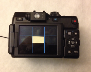
In the above photo I have broken a cardinal rule of photography composition — don’t put the subject of your photo in the center of the frame. Generally, photos with a dead-center subject tend to look too static, boring, dull — in a word, dead. I once read an article where the author recommended sticking a piece of masking tape in the center of the LCD screen on the back of your camera to make it hard to make that common error. It would look something like this:
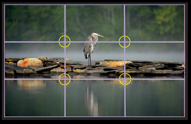
It is generally recommended that you follow “The Rule of Thirds” (cue harp music). How does that work? Well, imagine two horizontal lines that divide your image into three equal parts. Next, add two vertical lines that break the image up into three equal parts. In the case of my photo, it would look like this:
 To follow the rule of thirds you would align your subject along one of those four lines or at the intersection of those lines (shown by the yellow circles). If you are not sure how to compose the scene before you, start with the rule of thirds. Most cameras have a grid built into their display (check your manual folks) that you can turn on to help with composition.
I photographed the Blue Heron above from a kayak in Vermont over the summer. I took a variety of images, some closer, some further, some with the heron centered, others with him off to the left, then to the right. I oriented some in landscape and others in portrait. I really liked the color and texture of that narrow band of rocks and this centered composition allows the rocks to be the dominant element. For this scene, I think the symmetry works.
I have a similar image where I more closely followed the rule of thirds. But with that compositional change, I find that the heron becomes the dominant subject. A pleasing image, I think, but it tells a different story.
If we always followed the rules, life would be kinda boring, wouldn’t it? And all of our photos would look the same. Of course, there are no rules. A professional photographer told me once, “The only rule is that if it looks good, shoot it.”
Now that’s a rule I can live by.
Here is a fun video explaining the rule of thirds.
Until next month….michael
Nikon D4S, Nikon 200-400mm f/4 (@400mm), f/5.6, 1/1000, ISO 400


Patricia Mountjoy
Great shot. I was intrigued with the rocks, too, so appreciated your decision to center the photograph.
Can you imagine how much I would pay to develop various “poses” on film as you do with digital. Which would correspond with the time frittered away.Glad, though, that YOU do so much editing to produce such delightful compositions.
Will alligators make you hit list in Florida. How about some old tropical buildings for me.